About the Project
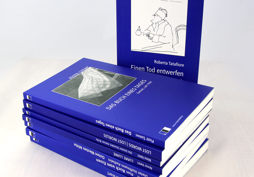
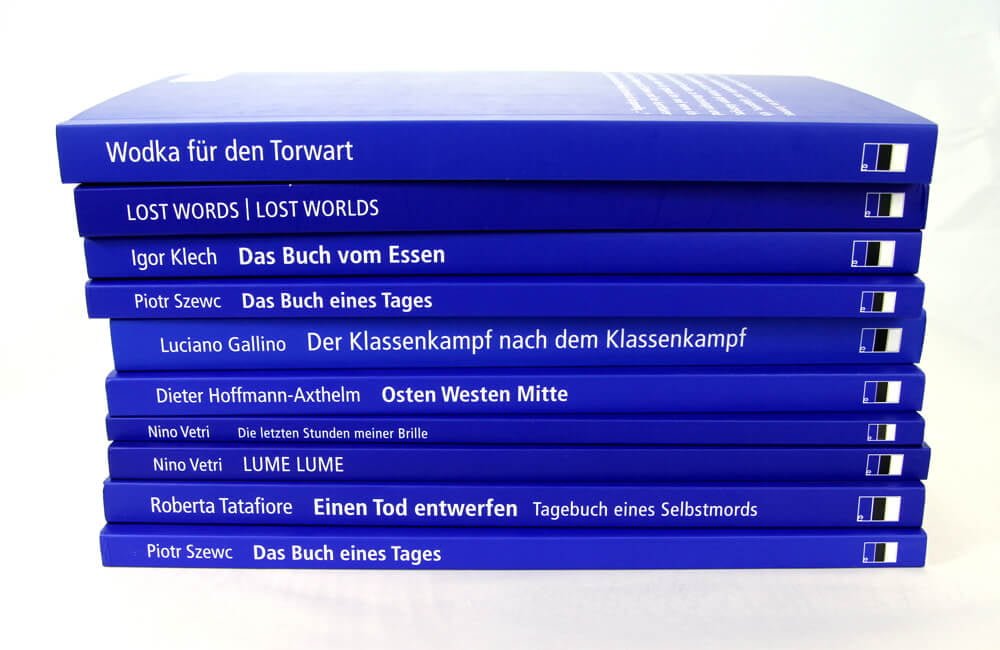
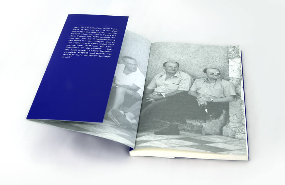
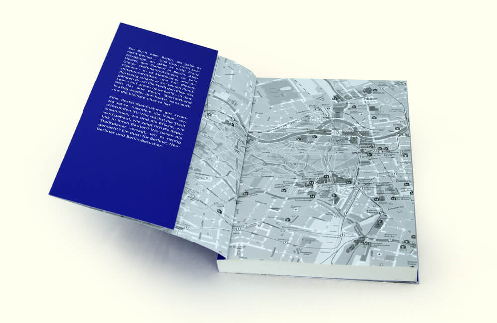
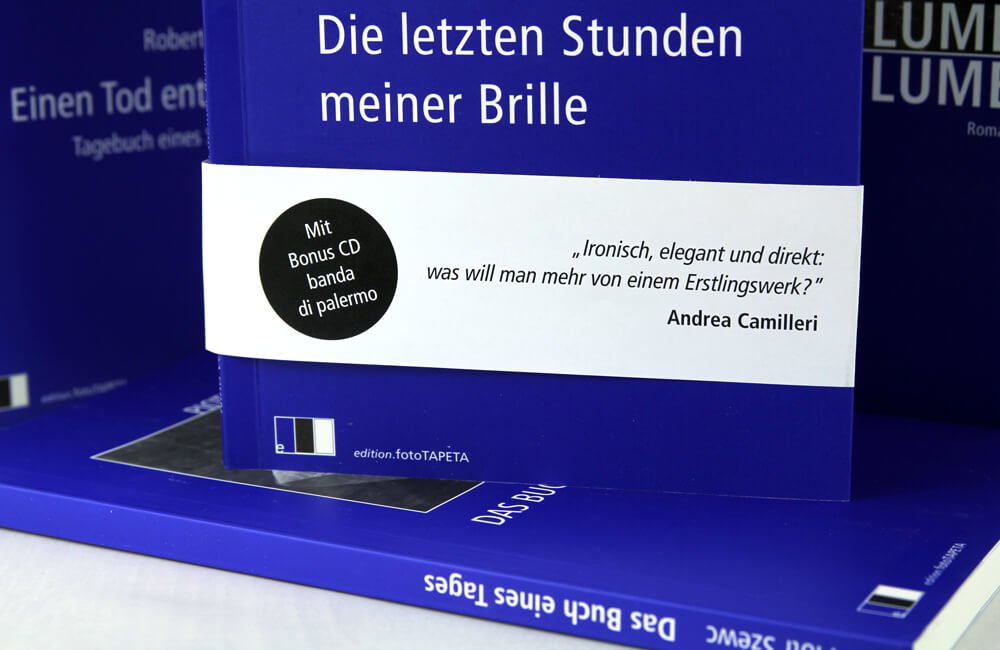
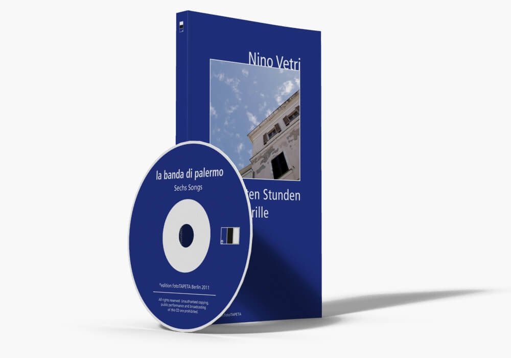
The tasks we were assigned by a very demanding and meticulous editor seemed easy only at first glance. Among other things, we were supposed to help them choose the right paper for the whole collection, find a printing house (preferably in western Poland) who would agree to print initially still small editions using offset lithography, negotiate prices, oversee the printing and finally deliver the whole edition to a distributor’s warehouse in central Germany. Analysis of many samples was finally followed by selecting Munken Print White stout paper, with a grammage of 90g/cm2, a thickness of 1.5 and a transparency of 92%. For the covers, we chose matte MaxiSilk 300g/cm2 chalk overlay paper with double side coating, which was not of no relevance because the inner side of the cover was also printed. As far as the printing house was concerned, there was no room for experimenting. We had no choice but to bet on quality and experience. The collection’s covers were printed using Pantone 72C, an additional colour which, to say the least, printers are not very fond of. Mainly because it needs a lot of time to dry. In addition, in our case the background colour had to be printed twice to become perfectly homogeneous. The printing house’s experience came in handy when adjusting the tone value of the print on the printable inner side of the cover on the first page of the book block. One should bear in mind that they are two completely different papers. Sometimes additional tasks came up, too, such as pressing and gluing records onto the inner side of the cover.
- Printing management
