About the project
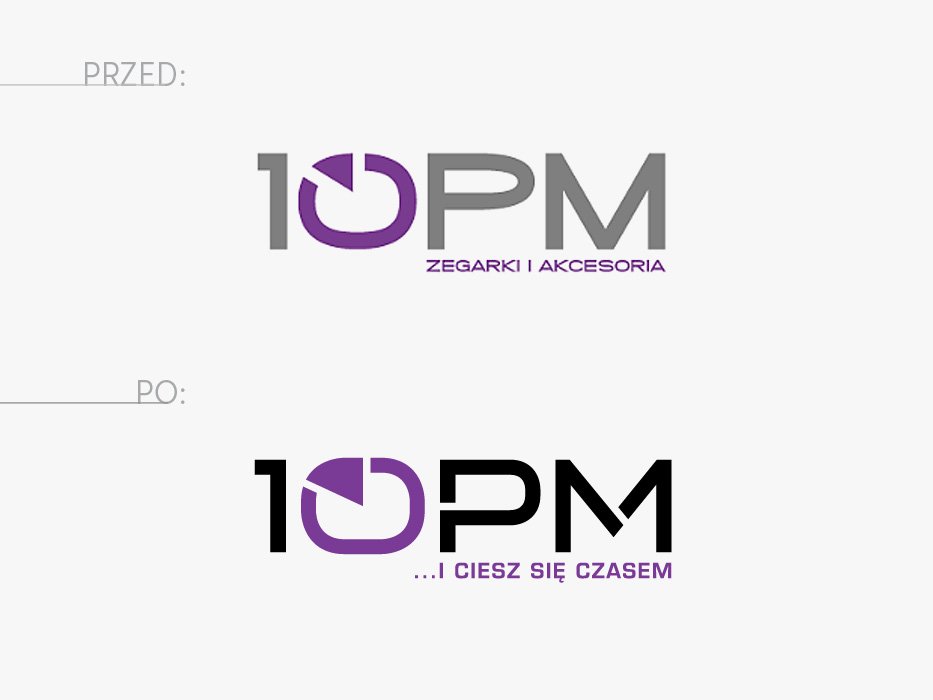
Gentle refreshing of the logotype for 10PM shop selling watches. The previous mark did not require revolutionary changes, which were only small, namely: improving zero shape, minimum slimming of all elements, changing of P and M letters, so that the whole is consistent (in the original logotype P letter had too flattened “belly” by what its curves did not match those of zero). In addition, characteristic intersections were added to P and M, which by the way introduced more light, breath and lightness to the mark, and grey was replaced by black. At the end, the readability of proposed by us new tagline was improved, which was approved by the customer. All these small changes made the mark more elegant.
- Lifting
- Tagline


